Logo
The Seakeeper logo portrays the spirit of the company through a rotating “S” that has wrapped itself around a spinning sphere. The solid, all caps, wide-type treatment carefully balances the movement of the “S” creating an unwavering, sturdy foundation. The combination of a fluid mark, strong font, and rich colors capture the innovative heritage of Seakeeper and represent its bright future.
Horizontal Logo
Vertical Logo
S Mark


Minimum Size
Care must be taken to ensure an optimum appearance of the logo in every size. The Seakeeper logo must be legible at all times.
Spacing
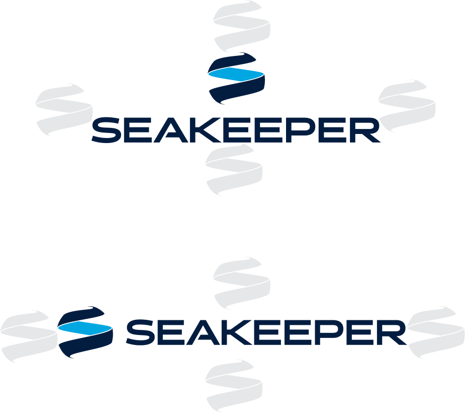
The spacing around the logo and typography can be freely selected in order to ensure a clear and unconstrained appearance of the logo. For orientation purposes, however, the Seakeeper S Mark height can be used as the minimum spacing guide.
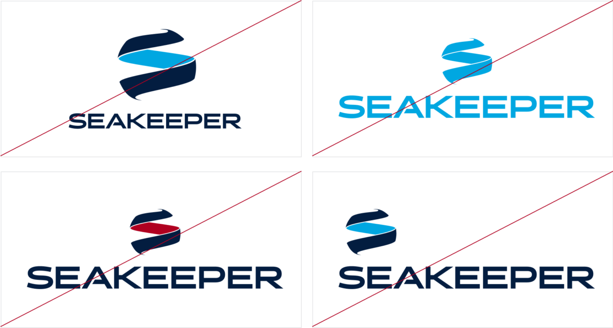
Seakeeper Logo Don’ts
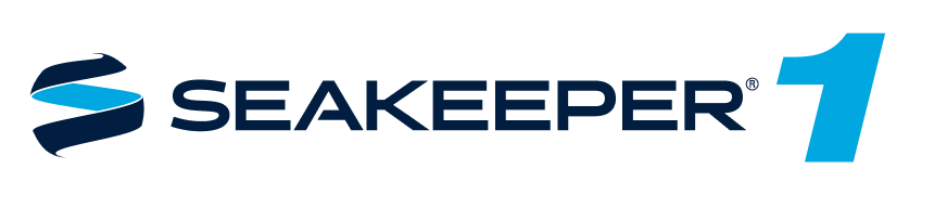
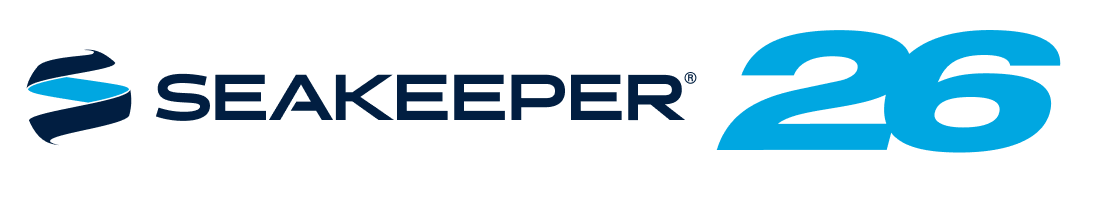
Seakeeper Product Logos